InferGauge Dashboard & Results Guide
How to read every panel, recognize chart patterns, and turn results into decisions · v0.5.1
1. The dashboard in one pass
Read it top-left to bottom-right, in this order:
- 1 — Score dial — the headline. Is the system healthy at this load?
- 2 — KPI cards (Response / Load / Tokens / Cost) — the vital signs behind the score.
- 3 — Timeline + saturation curve — the story over time and the scaling ceiling.
- 4 — SLA panel — the formal verdicts (these drive CI exit codes).
- 5 — Insights + Errors — the diagnosis and the failure breakdown.
Ten-second read: dial color → does cyan cross red on the timeline → is there a knee → any red FAIL rows. That answers “are we OK and why not” before reading a single number.
Live, not just final: every panel above updates while the run is still in progress — this isn’t a snapshot computed at the end.
- Provisional while running — the score dial carries the “provisional” flag until the run finishes and every configured SLA has enough samples to grade. Don’t compare a mid-run score to a finished one.
- Manual changes — adjusting concurrency mid-run with the dashboard’s +/- controls drops an amber marker on the event timeline the instant you click, so the intervention stays visible in the report afterward.
- Guardrail stops — if a spend, token, or rate-limit cap fires, the run ends immediately and a distinct “Guardrail” marker records why on the same timeline: a deliberate stop. The system under test didn’t fail.
When the run ends, on schedule or via a guardrail, this live view becomes the static result: the same numbers reappear in the terminal summary (Section 4) and, if synced, in the console and HTML report (Section 5).
The header
The bar at the top names the run and its target (“My AI Application · simulator/simulated-model · load test · target 25 users · 90s”), a live elapsed-vs-total clock, current users, and requests/sec, plus a status pill (“running”). The − / + stepper next to it is the manual concurrency control from “Manual changes” above; Stop test ends the run immediately.
1 — Score dial
The dial shows the live weighted score and a status line underneath: a grade (“DEGRADED” here, under 80) plus “PROVISIONAL” whenever not every component could be graded. Below it, each component lists its weight and current score, or “no SLA” if its threshold isn’t set in the config. Here, Token performance and Cost efficiency are ungraded, so only 75% of the weight counts: (30×89 + 25×44 + 20×98) / 75 ≈ 77, the score shown. Ungraded components are dropped from both the sum and the denominator rather than scored as zero. That’s exactly the “provisional” flag described above, and exactly what this run’s own Insights card names directly: “Score is provisional – only 75% of the scoring weight could be graded,” listing the two missing thresholds (sla.itl_p95_ms, sla.max_cost_usd) by name.
2 — KPI cards (Response / Load / Tokens / Cost)
Four cards, color-coded by their top border:
- Response (green) — avg, p95, p99, TTFT p95, inter-token p95. A * on a percentile flags it as provisional: too few samples yet for that tail to be trustworthy.
- Load (purple) — active vs. target concurrency, requests in flight, completed count, error rate, goodput, and quality (sampled): “off” means quality sampling wasn’t enabled for this run, so there’s no Pattern-5-style quality curve to read.
- Tokens (amber) — input and output totals, current tokens/sec, and output tokens per request.
- Cost (green) — spend so far, cost per request, and a peak-ceiling projection: the current spend rate extrapolated to full-time volume (“$29,128 PEAK CEILING · implies 5.24M req/mo” here). Treat it as a planning ceiling, not a bill (see the Results FAQ).
Every card keeps refreshing independently while the run is live, so don’t be surprised if two panels disagree by a small amount for a moment — they settle to the same numbers once the run ends.
3 — Timeline + saturation curve
Latency & Load Timeline plots p95 and avg latency (left axis, ms) and concurrent users (right axis) against elapsed seconds, with the SLA limit as a red dashed line and any events as vertical ticks — this is the chart Section 3’s patterns are read from. Saturation Curve plots p95 latency against concurrent users, one dot per one-second window; where the dots bend is the knee (Pattern 2).
4 — SLA panel
One row per SLA actually configured — threshold, the run’s live value, and a PASS/FAIL verdict. A component with no threshold set (Token performance, Cost efficiency, above) simply has no row here; the rows present are exactly what drives the CI exit code (Section 4).
5 — Insights + Errors
Insights & Recommendations surfaces rule-based diagnoses as they’re detected — each a headline, a plain-language explanation, and concrete next steps (config keys to set, or actions to take). Errors & Retries breaks failures down by type (e.g. server error) with a separate retry count, so “the provider rejected requests” and “we retried and it eventually worked” don’t get lumped together.
Export HTML report and Export JSON, at the bottom of the dashboard, produce the two artifacts covered in Sections 4 and 5. The footer line (infergauge · local run · data never leaves this machine) is the data-privacy promise made concrete: nothing but the exported files leaves this machine.
2. The Performance Score, with the math
The score is a weighted average of five components; each is scored 0–100 against your SLA targets:
| Component | Weight | What drives it |
|---|---|---|
| Latency | 30% | p95 end-to-end vs your p95 SLA (full points at half the limit, 70 at the limit, falling fast beyond) |
| Errors | 25% | Error rate vs your error-rate SLA |
| Goodput | 20% | % of requests meeting ALL SLOs simultaneously |
| Token performance | 15% | Inter-token latency vs its SLA (streaming smoothness) |
| Cost efficiency | 10% | Spend vs max_cost_usd (skipped if no budget set) |
Worked example (a real laptop Ollama run): latency far over limit → ~5, errors 0% → 100, goodput 0% → 0, ITL healthy → ~90, cost unset → skipped. Weighted: (30×5 + 25×100 + 20×0 + 15×90) / 90 ≈ 44 — the “44/100 critical” you saw. The dial’s component list always shows this breakdown, so never quote the score without its explanation.
Grades: 80+ healthy · 55–79 degraded · <55 critical. The score is comparable between runs of the SAME config; comparing scores across different SLAs or providers is meaningless.
One cost setting, two jobs — don’t confuse them. sla.max_cost_usd feeds the Cost-efficiency score above and reports a cost breach; it never stops anything. The guardrails.max_spend_usd cap is the hard stop that aborts the run in flight. Set the SLA to grade cost; set the guardrail to cap it.
3. Chart patterns — if it looks like this, it means that
Pattern 1: Healthy
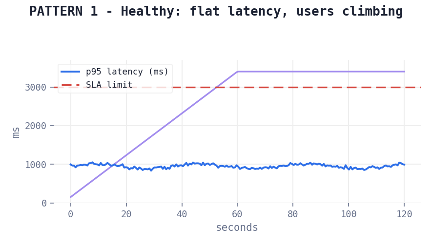
Latency stays flat (or rises gently) while users climb, well under the SLA line. Meaning: headroom. Action: raise users until you find the ceiling — a test that never stresses the system tells you nothing about capacity.
Pattern 2: The saturation knee
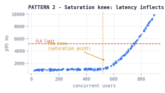
On the p95-vs-users scatter, dots run flat then bend sharply upward. The bend is the saturation point — beyond it latency grows non-linearly because requests queue faster than they drain. Meaning: this user count is your current capacity ceiling. Action: plan capacity below the knee; to move the knee, add replicas/quota, cache, or shrink prompts. Report the knee, not the max users tested.
Pattern 3: The queueing signature
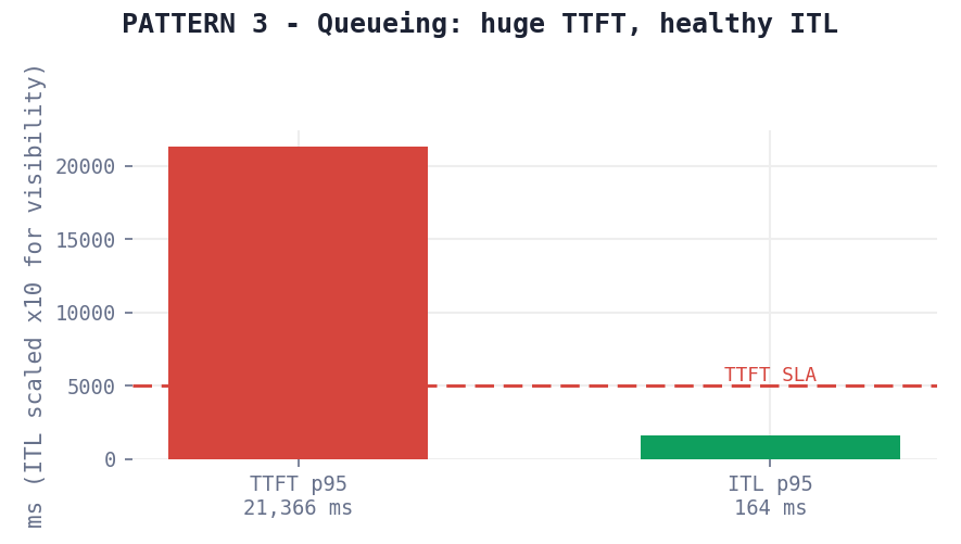
TTFT enormous while inter-token latency is healthy. The model generates fine once it starts — requests are waiting in line first. Classic causes: serial request handling (Ollama default), gateway queues, provider admission control. Action: enable parallelism (OLLAMA_NUM_PARALLEL, more replicas). The model isn’t the problem. The reverse (healthy TTFT, rising ITL) means generation itself is compute-bound: reduce max_tokens or add compute.
Pattern 4: Drift at constant load
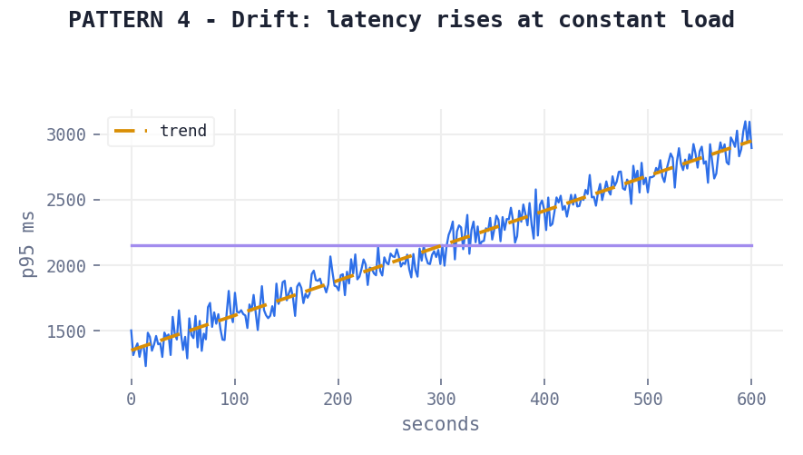
Latency trends upward while users stay flat; this is only visible in endurance tests. Meaning: something accumulates: memory pressure, queue build-up, growing context, provider congestion. Action: confirm with a longer endurance run; check per-conversation context growth; watch tokens-out-per-request on the Tokens card. If it drifts up too, context growth is your culprit.
Pattern 5: Quality degrades under load
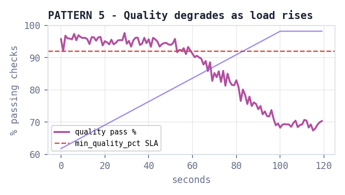
The quality pass-rate falls as users rise — responses become truncated, malformed, or incomplete exactly when the system is busy. This is invisible to pure latency testing and to quality tools that test one request at a time; it is InferGauge’s signature finding. Action: inspect timeout/retry behaviour (retries often return partial output), fallback routing to smaller models, and provider behaviour at rate limits.
4. Reading the end-of-run terminal summary
The block printed after every run, annotated line by line:
requests   8 ok / 15 errors (65.2%)   0.26 req/s      <- volume & the real throughput ceiling
errors     rate limit: 12, timeout: 3                 <- only shown when errors exist; each type = different fix
latency    avg 24384ms  p95 31150ms  p99 31469ms      <- quote p95; avg hides the tail users feel
ttft p95   21366ms    itl p95 163.9ms                 <- the TTFT-vs-ITL diagnosis pair (see Pattern 3)
tokens     288 in / 585 out                           <- real work done; 0 tokens = nothing succeeded
goodput    25.0%                                      <- % meeting EVERY SLO; the honest single number
cost       $0.0 ($0.0/req, ~$0/mo at this rate)       <- projection assumes this rate 24/7
score      38/100 (critical)                          <- headline; components on the dashboard dial
PASS/FAIL rows                                        <- exactly what CI enforces (exit code 0/1)
insight bullets                                       <- the diagnosis; read these before the numbers
Key nuance: "FAILED" with zero errors is not a contradiction — it means every request succeeded but too slowly (or too expensively) to meet the SLA. That is a capacity finding, and often the most valuable output of the test.
5. Reading the HTML report
The export (dashboard footer, or --report in CI) is a standalone file for stakeholders. Its order is an argument: masthead verdict (score + grade) → score component bars → KPI cards with PASS/FAIL badges → latency chart → throughput chart (green ok / red error bars) → quality-under-load chart → token performance → SLA table → error breakdown → insights → event timeline.
- For executives: masthead + KPI badges + insights. Sixty seconds, complete picture.
- For engineers: the three charts + error taxonomy + event timeline (every manual intervention is marked, so the data’s provenance is visible).
- For tickets: attach the report AND the run id from .infergauge\runs — the JSON alongside it makes every claim re-checkable.
6. Comparing runs and regression verdicts
infergauge compare prints baseline vs current with a delta column. Green = improved, amber/red = worsened, direction-aware (lower is better for latency/errors/cost; higher is better for throughput/goodput/quality). With --max-regression-pct N, any metric worsening beyond N% is flagged ‹- REGRESSION and the exit code becomes 1 — that is the CI gate.
- Compare like with like: same config, same provider, same duration. A 30s run vs a 300s run is not a comparison.
- Run twice before believing a number: first runs pay cold-start costs (model loading, cache warming) — a real effect worth measuring deliberately, not accidentally.
- Expect noise: single-digit percentage deltas on short runs are usually noise; set regression thresholds at 10–15%, not 2%.
7. Decision playbook
| You see | It means | Do |
|---|---|---|
| Score green, flat timeline, no knee found | Test never stressed the system | Increase users until the knee appears; report the knee |
| High TTFT, healthy ITL | Queueing / admission control | Add parallelism, replicas, or quota — not a faster model |
| Healthy TTFT, rising ITL | Generation compute-bound | Reduce max_tokens; add compute; consider faster model tier |
| 429s appear at a user count | Provider rate limit = your ceiling | Raise quota tier, add backoff/queueing, spread across keys |
| Latency drifts at constant load | Accumulation (memory/queue/context) | Endurance test to confirm; check context growth per conversation |
| Quality % falls as users rise | Degradation under pressure | Inspect retries/partial outputs and fallback routing |
| Goodput far below pass rates | Requests fail different SLOs each | Fix the binding constraint first — check which SLA row is red |
| Cost projection alarming | Ceiling estimate at current rate | Check $/request and in/out split; cap max_tokens; cache prompts |
| FAILED, zero errors | SLA breach, not malfunction | Read SLA rows; either fix capacity or set realistic limits |
| Run stopped before its duration; a "Guardrail" event on the timeline | A hard stop fired — a spend, token, or rate-limit cap | Intended budget/quota protection. Read the exit reason; raise the cap in the guardrails block only if the run should have continued. |
8. Results FAQ
- Why is goodput lower than my pass rates? — Because goodput requires EVERY SLO on EVERY request. 0% errors and 25% goodput means all requests worked, but 75% missed at least one latency/quality target.
- How literal is the projected monthly cost? — It is a planning ceiling: current spend rate extrapolated 24/7. Real traffic is bursty; treat it as “worst case if this load were constant.”
- When can I trust the score? — When comparing runs of the same config. Across different SLAs, providers, or hardware, compare raw metrics instead.
- Why was my second run 30% better? — The first run pays cold starts (model load, cache warm). Measure both: cold-start behaviour is real production behaviour after deploys and scale-ups.
- Do my +/- clicks invalidate the test? — Yes — amber event lines mark every manual change, and the run is annotated. For clean SLA evidence, prefer untouched runs; use interventions for exploration.